Supervised learning
Introduction
“Supervised learning” refers to building a model with a data set that includes records that have values for a response variable of interest (for example, crop yield), and for predictor variables (for example, rainfall and fertilizer application rates).
In matrix notation these models have the form \(\hat{Y} = \hat{f}(X) + \epsilon\), where \(\hat{Y}\) (Y-hat) is a vector of model predictions for the variable of interest; \(X\) is the matrix with predictor variables; and \(\epsilon\) (epsilon) is the unexplained variation. The art is to find the most appropriate function \(\hat{f}\) (f-hat) — that is the one that most closely resembles the true function \(f\). In the next paragraph, we illustrate that the best model is not necessarily the model that minimizes the unexplained variation (\(\epsilon\)).
Over-fitting versus under-fitting
linear regression model
Over-fitting a model means that the model fits the data that was used to
build the model very well — in fact too good. Let’s look at that with a
simple data set where we have a response variable y and a single
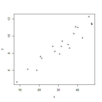
predictor variable x.
x <- c(35, 47.2, 20.7, 27.1, 42.5, 40.1, 28.2, 35.8, 47.4,
        21.3, 39, 30.6, 18.7, 8.4, 45.8, 14, 47.3, 31.5, 38, 32)
y <- c(9, 11.5, 7.6, 8.8, 9.8, 11, 8.2, 8.6, 11.4, 7.4,
        11.1, 7.9, 6, 4.6, 12.3, 6.1, 11.4, 8.8, 10.3, 9.4)
plot(x, y)
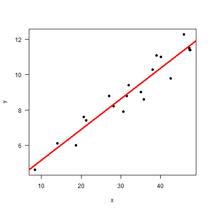
We could build a simple linear regression model like this
mlr <- lm(y~x)
plot(x, y, pch=20, cex=1.5, las=1)
abline(mlr, col="red", lwd=3)
summary(mlr)
##
## Call:
## lm(formula = y ~ x)
##
## Residuals:
##      Min       1Q   Median       3Q      Max
## -1.02846 -0.32128 -0.09411  0.47323  0.93314
##
## Coefficients:
##             Estimate Std. Error t value Pr(>|t|)
## (Intercept)   3.4050     0.4266   7.982 2.53e-07 ***
## x             0.1738     0.0124  14.021 3.97e-11 ***
## ---
## Signif. codes:  0 '***' 0.001 '**' 0.01 '*' 0.05 '.' 0.1 ' ' 1
##
## Residual standard error: 0.6214 on 18 degrees of freedom
## Multiple R-squared:  0.9161, Adjusted R-squared:  0.9115
## F-statistic: 196.6 on 1 and 18 DF,  p-value: 3.967e-11
A linear regression model takes the form \(\hat{y} = \beta_0 + \beta_1 x_1 + \beta_2 x_2 + ...\) where \(\beta_0\) is the intercept and the other \(\beta\)s are slopes. In this case we found \(\hat{f}\) to be y = 3.4 + 0.17x.
I hope you will agree that this looks very good. The line seems to capture the general trend; the model R2-0.92, and the p-values for the model parameters are very small (strong support for the intercept and slope being unequal to zero). But can we do better?
Spline model
Linear regression models with a single predictor variable are not very flexible. Let’s try another extreme, a spline function. A spline model is referred as a non-parametric model (this is a misnomer, it has, in fact, a lot of parameters, so many that we do not want to consider them, as we cannot easily interpret them).
# create the function from the data
sf <- splinefun(x, y)
# x prediction points
px <- seq(1, 50, 0.25)
# predictions
py <- sf(px)
plot(x, y, pch=20, cex=2, las=1)
abline(mlr, col="red", lwd=3)
lines(px, py, col="blue", lwd=3)
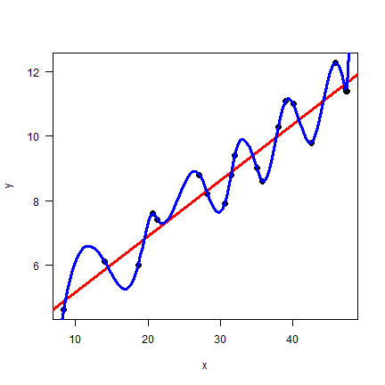
Wow. Model sf seems perfect. Let’s compare the two models with the
Root Mean Squared Error (RMSE) statistic.
Root Mean Squared Error
The Root Mean Squared Error (RMSE) is a commonly used metric to compare models with a quantiative repsonse. For qualitative responses measures such as kappa are used, and if the response if true/false (presence/absence) ROC-AUC is commonly used.
Here is a function that implements RMSE.
rmse <- function(obs, prd, na.rm=FALSE) {
    sqrt(mean((obs - prd)^2, na.rm=na.rm))
}
Let’s test this new function. We have observed values of 1 to 10, and a three different predictions.
# no difference, perfect model
rmse(1:10, 1:10)
## [1] 0
# a small difference, not bad
rmse(1:10, 2:11)
## [1] 1
# rather different, much worse than the above
rmse(1:10, 10:1)
## [1] 5.744563
So the more different the observed and predicted data are, the higher the RMSE. The scale of the RMSE is in units of the data. To make it easier to interpret RMSE values, you can express them relative to a Null model. A Null model is a simple, perhaps naive model, that can serve as an important benchmark. To evaluate a complex model it is often not of prime interest to know how good it does, but rather how much better it does than a Null model.
With the example data above, a good Null Model might be the mean value of the observed data.
null <- rmse(1:10, mean(1:10))
null
## [1] 2.872281
A function that computes the RMSE relative to a NULL model could look like this.
rmsenull <- function(obs, pred, na.rm=FALSE) {
    r <- rmse(obs, pred, na.rm=na.rm)
    null <- rmse(obs, mean(obs))
    (null - r) / null
}
Let’s use it.
rmsenull(1:10, 1:10)
## [1] 1
rmsenull(1:10, 2:11)
## [1] 0.6518447
rmsenull(1:10, 10:1)
## [1] -1
A perfect model explains 100% of the RMSE of the Null model. In the
example above, the prediction 2:11 explains 65% of the Null model.
That is very good! The prediction 10:1 is worse than the Null
model.
Compare models
Now we can use our rmsenull method with our two models, and compare
their performance.
For the linear regression model
plr <- predict(mlr, data.frame(x=x))
rmsenull(y, plr)
## [1] 0.7103717
And for the spline model
psf <- sf(x)
rmsenull(y, psf)
## [1] 1
By this measure, the spline model is perfect. The linear regression model might still be fit for purpose, but it does not look as good as the spline model.
However, we made a major mistake in our model evaluation procedure. We should not evaluate the model with the same data that we used to build the model. Because if we do so, we are guarenteed to select models that are overfit. To illustrate this, let’s split the data in a two samples (this is not generally the best practise, see the section on cross-validation).
n <- length(x)
set.seed(321)
i <- sample(n, 0.5 * n)
i
##  [1] 18 13 16 17  4 15 11  9 12  2
xa <- x[i]
ya <- y[i]
xb <- x[-i]
yb <- y[-i]
Now train (fit) and test (evaluate) the models again. First use sample “a” to train and sample “b” to test.
mlr_a <- lm(ya~xa)
sf_a <- splinefun(xa, ya)
plr_a <- predict(mlr_a, data.frame(xa=xb))
psf_a <- sf_a(xb)
rmsenull(yb, plr_a)
## [1] 0.6423837
rmsenull(yb, psf_a)
## [1] -0.929826
Now use sample “a” to test and sample “b” to train.
mlr_b <- lm(yb~xb)
sf_b <- splinefun(xb, yb)
plr_b <- predict(mlr_b, data.frame(xb=xa))
psf_b <- sf_b(xa)
rmsenull(ya, psf_b)
## [1] -2.512748
rmsenull(ya, plr_b)
## [1] 0.7028963
In both cases the linear regression model peforms much better. The mean RMSE, relative to the Null model, for the linear regression model is ( 0.64 + 0.7 )/2 = 0.67, much smaller than for the the spline model ( -0.93 + -2.51 )/2 = -1.72. Also note that the RMSE for the linear regression model is similar to the RMSE computed with the model training data when it was fit will all data (0.71). That is also easy to see visually.
#set up the plot
plot(x, y, las=1, cex=0, xlim=c(0,80), ylim=c(3,15))
# original models
abline(mlr, col="red", lwd=2, lty=3)
lines(px, py, col="blue", lwd=2, lty=3)
# sample A models
abline(mlr_a, lwd=2, col="red")
lines(px, sf_a(px), lwd=2, col="blue")
# sample B models
abline(mlr_b, lwd=2, col="red", lty=2)
lines(px, sf_b(px), lwd=2, col="blue", lty=2)
# sample A and B points
points(xa, ya, cex=1.5)
points(xb, yb, cex=1.5, pch=19)
# a complex legend
legend("bottomright", pch=c(1,19,rep(NA, 10)), lty=c(NA, NA, rep(c(NA, NA,1,2,3),2)), lwd=2, , pt.cex=1.5, bg="white",
    legend=c("Sample A", "Sample B", "", "Linear regression", "sample a", "sample b", "all data", "", "Spline model", "sample a", "sample b", "all data"),
    col=c("black", "black", "white", "white", rep("red", 3), "white", "white", rep("blue", 3))
)
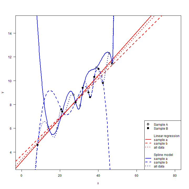
The spline model fit the training data perfectly, but that made it
predict spectacularly bad for some of testing data. The linear
regression model is not very flexible, so it did not change much when it
only got the subset of data. This is an important feature. The linear
model has low variance. That is, the estimated model does not change
much when it is estimated with slightly different input data (do not
confuse this use of the word “variance” with how it can be used to
describe variability in a sample of quantitative observations). This is
very important as a model only has value if it has some generality, not
if it just fits a particular dataset. Note that the RMSE are essteniall
for an interpolation problem. When x is between 15 and 40, the
spline model is much worse than the linear regression model, but the
three models (all data, sample A, and sample B) are somewhat similar.
However, if we were to use these models for extrapolation (in practical
terms, think predicting to a different region, group of people, time
period), the results would be dramatically unreliable as the different
spline models show extreme, but opposite responses. This does not mean
that the linear model is right — we have no data for x < 8 or x > 48.
The true model
Well, in this case, we actually do have . The data for x and y
were sampled (and then rounded to 1 decimal) from a known function —
we do not have these for the real world. But we can use functions like
that to generate data to learn about modeling methods. We used the
function f below to generate the data used in this section.
f <- function(x) x/10 + sin(x) + sqrt(x)
X <- seq(1,50,0.1)
plot(X, f(X), type="l")
And the following procedure to create the sample data.
set.seed(2)
sx <- sample(X, 20)
sy <- f(sx)
So, the linear model clearly was wrong. But, then, all model are wrong. Some models are more useful than others, and the linear model might be close enough to be fit for purpose.
Can flexible models be good?
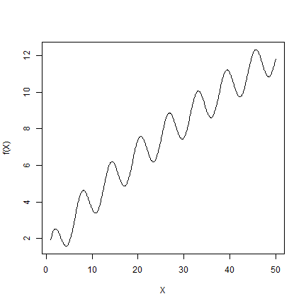
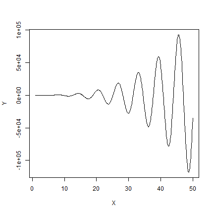
So is a single variable linear regression always better than a spline model? No. It depends. It depends on how linear the relationship between x and y, and it also depends on the sample size. The more complex the model, and the larger the sample size, the better the spline might do. Here is simple example where the spline model does better.
The true model:
f <- function(x) {x - x^2 + x^3*sin(x)}
X <- seq(1,50,0.1)
Y <- f(X)
plot(X, Y, type="l")
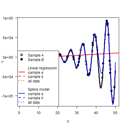
Two samples from the true model. Here we do not add error to the data —
but that is often done to simulate the effect of measurment error. It is
easy to do with a function like runif or rnorm.
set.seed(2)
xa <- sample(X, 40)
ya <- f(xa)
xb <- sample(X, 40)
yb <- f(xb)
And compare the two models again
mlr <- lm(ya~xa)
sf <- splinefun(xa, ya)
rmsenull(yb, predict(mlr, data.frame(xa=xb)))
## [1] -0.0312567
rmsenull(yb, sf(xb))
## [1] 0.8082887
mlr <- lm(yb~xb)
sf <- splinefun(xb, yb)
rmsenull(ya, predict(mlr, data.frame(xb=xa)))
## [1] -0.04616483
rmsenull(ya, sf(xa))
## [1] 0.7672714
In both instances, the spline model RSME is about five times smaller.
px <- seq(1, 50, 0.25)
py <- sf(px)
plot(X, Y, type="l", lwd=3, las=1)
points(xa, ya, cex=1.5)
points(xb, yb, pch=19, cex=1.5)
abline(mlr, col="red", lwd=2)
lines(px, py, col="blue", lwd=2)
legend("bottomleft", pch=c(1,19,rep(NA, 10)), lty=c(NA, NA, rep(c(NA, NA,1,2,3),2)), lwd=2, , pt.cex=1.5, bg="white",
    legend=c("Sample A", "Sample B", "", "Linear regression", "sample a", "sample b", "all data", "", "Spline model", "sample a", "sample b", "all data"),
    col=c("black", "black", "white", "white", rep("red", 3), "white", "white", rep("blue", 3))
)
What have we learned?
We should note that these stylized examples have little to do with real
data, where you might have a lot of noise and multiple observations for
y for each x. Perhaps you can look at that in a simulation of
your own? But we hope that this section helped illustrate (a) the risk
of overfitting; (b) that models should be evaluated with data that was
not used to train the model.
There is much more to say about linear regression. In practice you often have many predictor variables. Or you can create new pridictor variables by creating squares and cubes, or interactions. For example, you can do
mlr <- lm(ya ~ xa+I(xa^2)+I(xa^3))
With each parameter you add flexibility to the model. That can lead to overfitting, and a loss of interpretability. See the sections on stepwise model selection, and on lasso and ridge regression in ISLR for detailed discussion.
Like in lasso and ridge regression, spline models can be constrained (made less flexible) through some form of regularization. In these “smoothing spline” models, there is a penalty function that reduces the amount of flexibility.
Complex models
There are various algorithms than can be used to make relatively complex models for predictions with large data sets, with many variables, of which several may contribute to the model, perhaps with complex interactions, and likely noisy data. Popular examples of such (“machine learning”) algorithms include Random Forest, Support Vector Machines (SVM), and Artificial Neural Networks (ANN).
The next chapter focuses on the Random Forest algorithm as an example.
Citation
Hijmans, R.J., 2019. Statistical modeling. In: Hijmans, R.J. and J. Chamberlin. Regional Agronomy: a pratical handbook. CIMMYT. https:/reagro.org/tools/statistical/